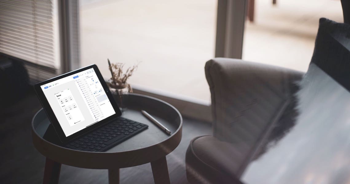
Recently, while on a brainstorming session with our team’s UX designer, the idea of a haptic feedback addition to the app came up. However, I was surprised to find out that the design team was unaware there are several options to choose from when it comes to haptic feedback. So, the idea of a simple app displaying all haptic feedbacks sneaked into my mind. Due to the hustle and bustle that was taking place at the office, the idea came again to my mind on a very slow Sunday, while I was watching Netflix. So, I grabbed my iPad and started a new project.
The idea was simple. One screen with a button for each haptic feedback, so the user will be able to “feel” the sensation of each feedback. I created a new project in Kodika.io app builder and started to drag-and-drop icons, buttons, and some blocks for a couple of minutes. I created one screen and dragged seven buttons, each one to display one haptic feedback. I added some labels and images to make the app more user-friendly, and then went to the functions and created one for each button to work as its action. I connected each button’s event to a function, and that was it! Finally, I added a logo icon, and my prototype iOS app was ready to be reviewed.
Next day, I showed the app to the designer, and he was quite impressed. So impressed, that he requested a second screen, which shows the information regarding each haptic feedback. I was not surprised by that request; designers always want to reach that extra mile. That night, at the comfort of my couch, I grabbed my iPad again and created the information screen. Immediately I texted him to check out the new version on his iPhone, and he gave the green light for the Release to App Store.
To be quite honest, although I created this app as a personal project to make communication with the design team easier, we decided to upload Haptic Sense app in App Store and now has much more downloads than expected.
Reach out to tell us your Kodika story and see it published on our blog! #kodikastories
